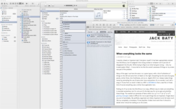
I recently missed an important task I had given myself. It had been appropriately entered into OmniFocus, but I’d assigned it the wrong context or whatever and it just sort of disappeared into the pile. While trying to figure out what had gone wrong – why my trusted system failed – it occurred to me that the overall sameness of things on my screen was part of the problem.
Many of the apps I use have the same 2 or 3-pane layout, with a list of collections of things on the left and some form of detail on the right. Everything has the same blue-gray panels, similar fonts, list of attributes, and so on. Apple’s OS X 10.7 release makes things worse by promoting the use of same-color icons everywhere. It’s no wonder I can’t tell a song in iTunes from an email in Mail to a PDF in DEVONthink from a text file in Finder. And of course everything uses a similar blue application icon.
Putting all of my to-dos into OmniFocus is an easy, efficient way to make sure everything is recorded somewhere, but I’m not sure it’s the best way for me to spot and prioritize those things. The washed out sameness of items within our 3.5” or 11” (or 13” or 27”) glowing rectangles makes it difficult for me to spot things that are important. Forget about any sort of serendipity. My perfectly organized and vitally important to-do list looks much like my completely unnecessary iTunes playlists. It takes too much work to decide what I should be looking at on the screen.
Consistency is great, until it homogenizes everything to the point of important things becoming indistinguishable from what should be background noise.
One way I break away from this is by using software that looks different. Something like Tinderbox looks nothing like the other software I use. Tinderbox uses all sorts of helpful visual tricks to help me not only organize information, but to recognize the important things later – at a glance.
The ease of organization in software isn’t always helpful, especially when the result doesn’t look any different. In fact, moving things around in software as an attempt to “organize” them can make things worse, turning the whole process into a sort of cup and ball trick.
Visual distinction is one advantage of writing things on paper. I can visually scan a hand-written list of to-dos and spot things simply based on the shape and position of each item. That happens automatically by virtue of the way writing on paper works. Plus, physically moving paper around a desk or on a bulletin board helps with later recognition and processing. I read somewhere that “When the hand moves, the mind moves.” Similarly, things that look the same end up being the same, and finding ways to differentiate the important is something I’m working on.
